CLIENT
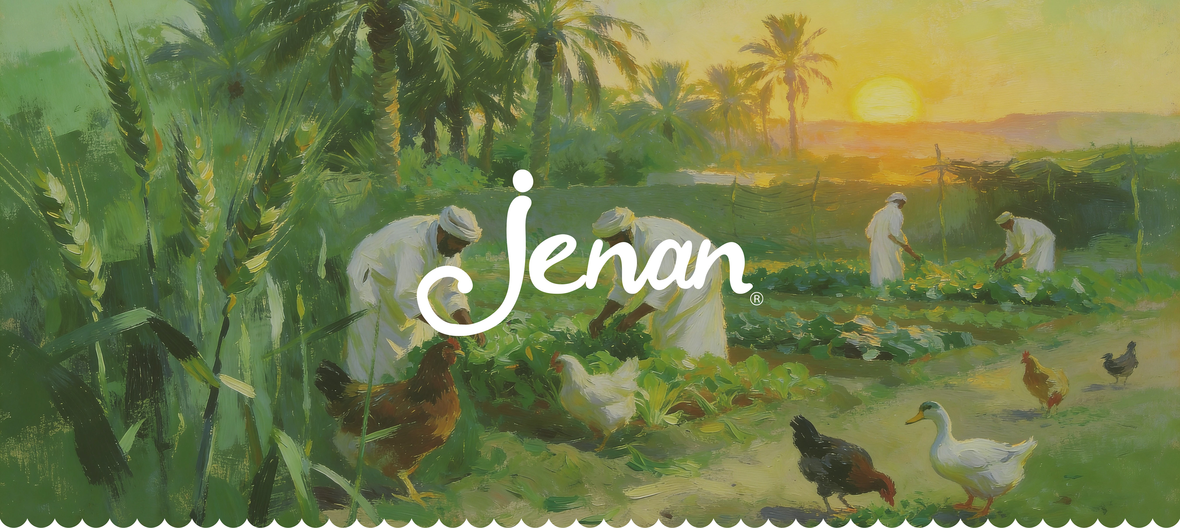
Jenan is a flagship brand from the house of Al Ghurair Foods, a cornerstone of the UAE’s food manufacturing industry. With a story that began with flour milling in 1976, the brand has grown into a household staple, offering a diverse basket of locally produced goods including oats, eggs, oils, pasta, and noodles.
ASSIGNMENT
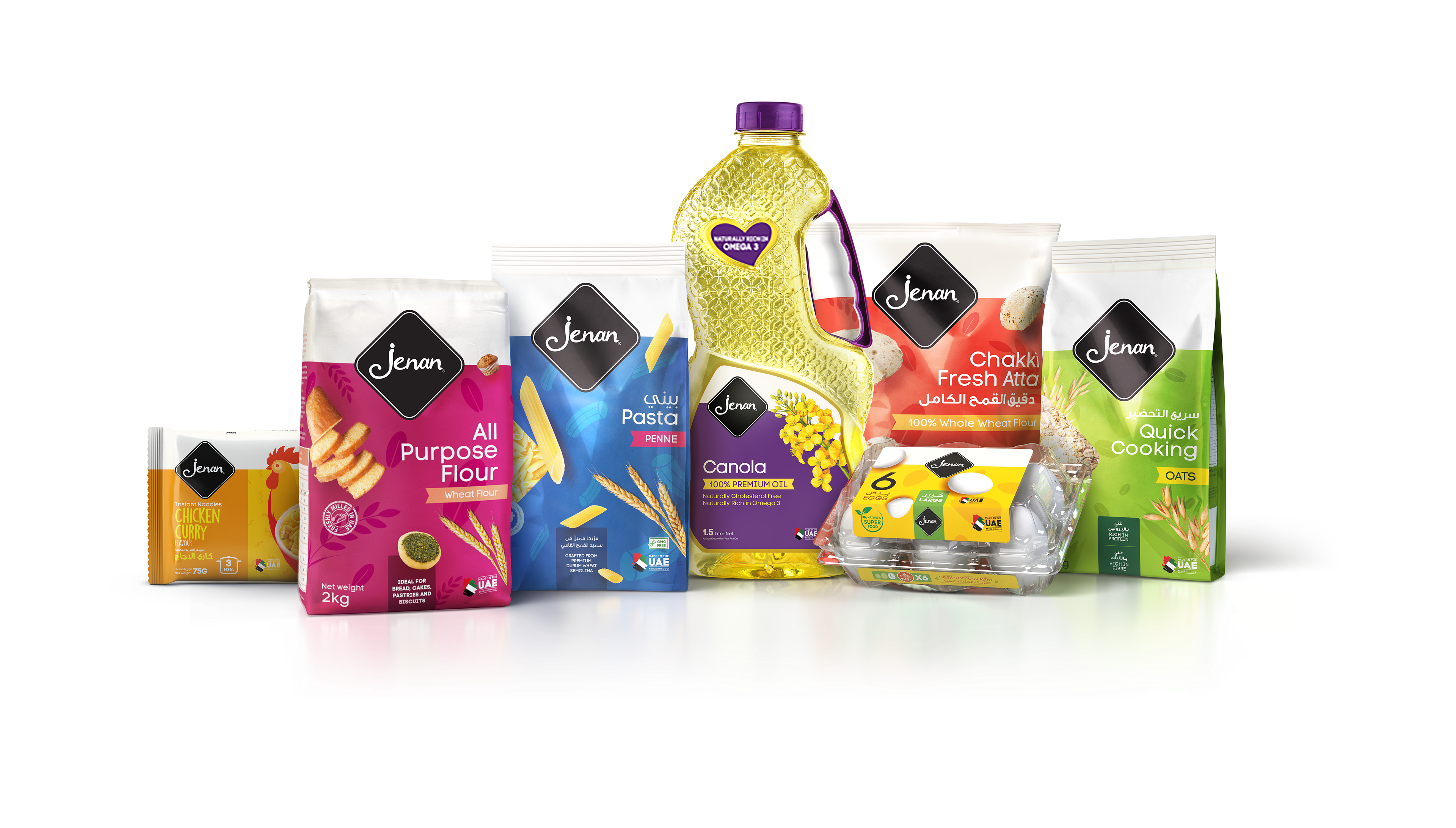
The objective was to modernize Jenan’s visual identity and packaging architecture. The challenge lay in unifying a fragmented portfolio where diverse products from 10kg Atta bags to 1.5L Oil bottles lacked a cohesive visual language. A critical constraint was to retain the original logo typography to preserve consumer equity, requiring a system that could refresh the brand without losing its identity.
SOLUTION & PROCESS
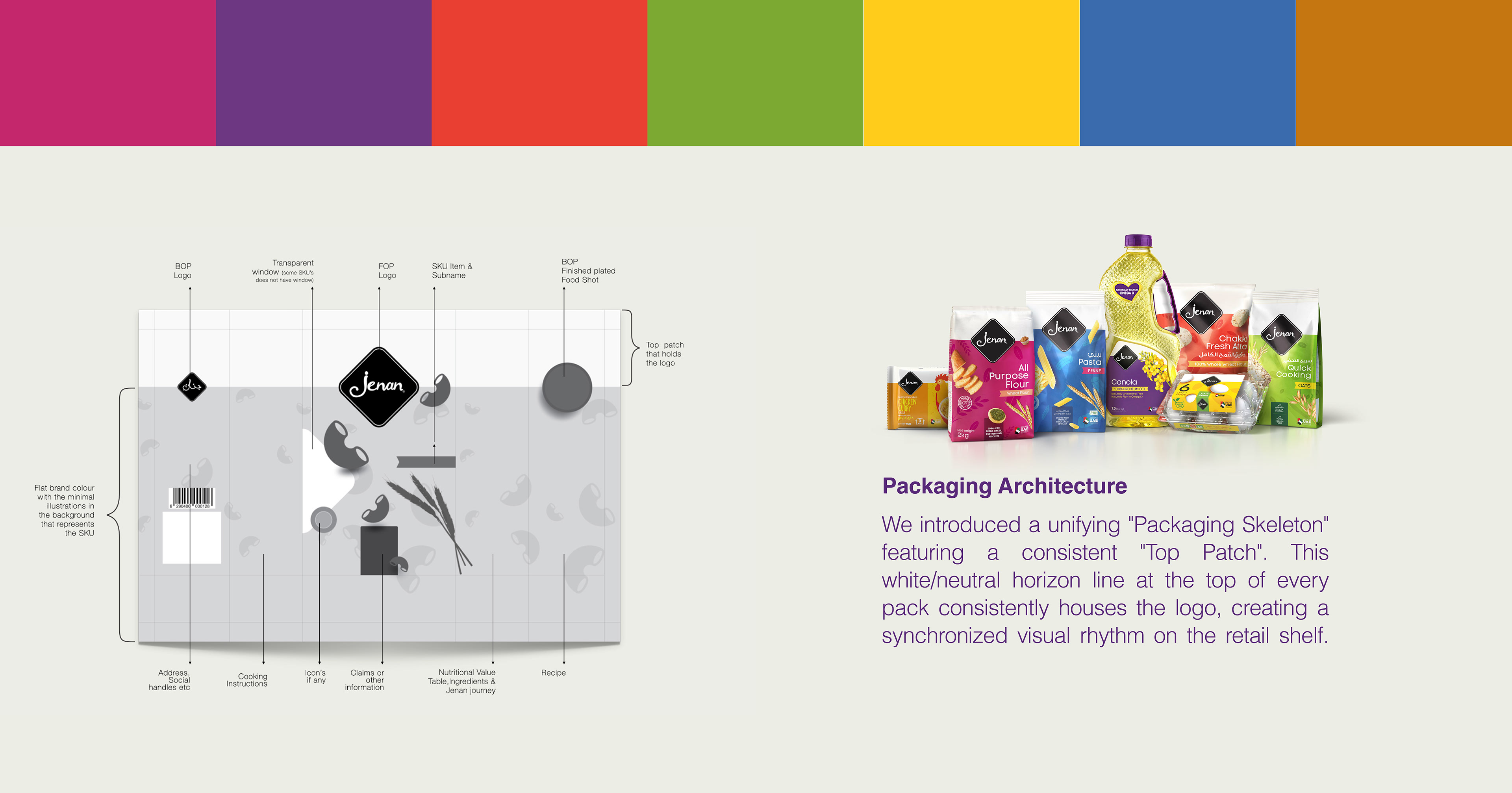
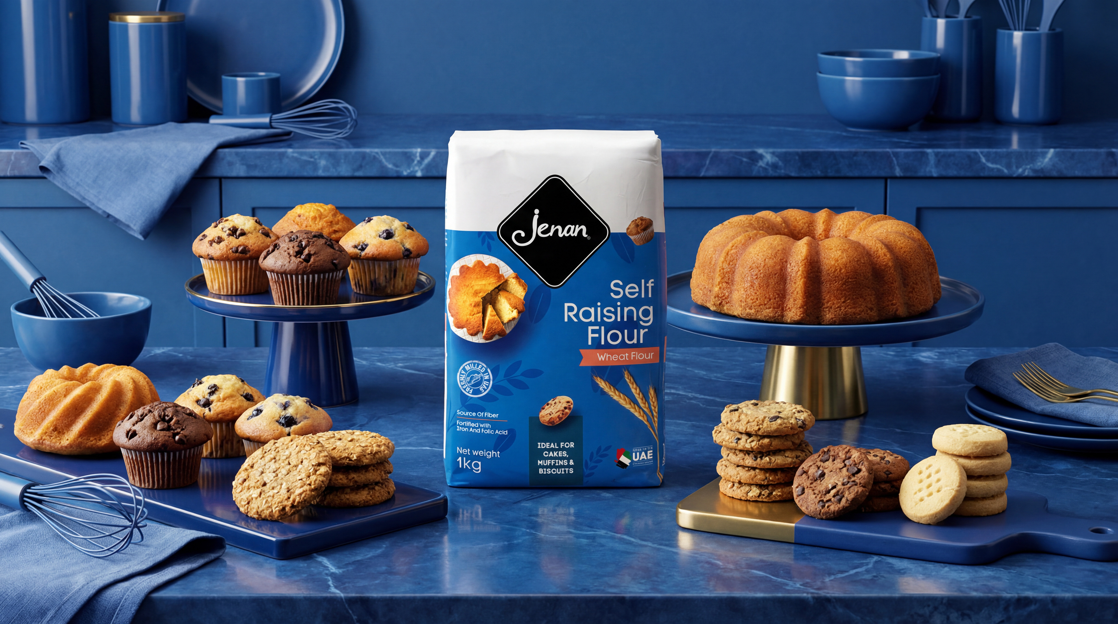
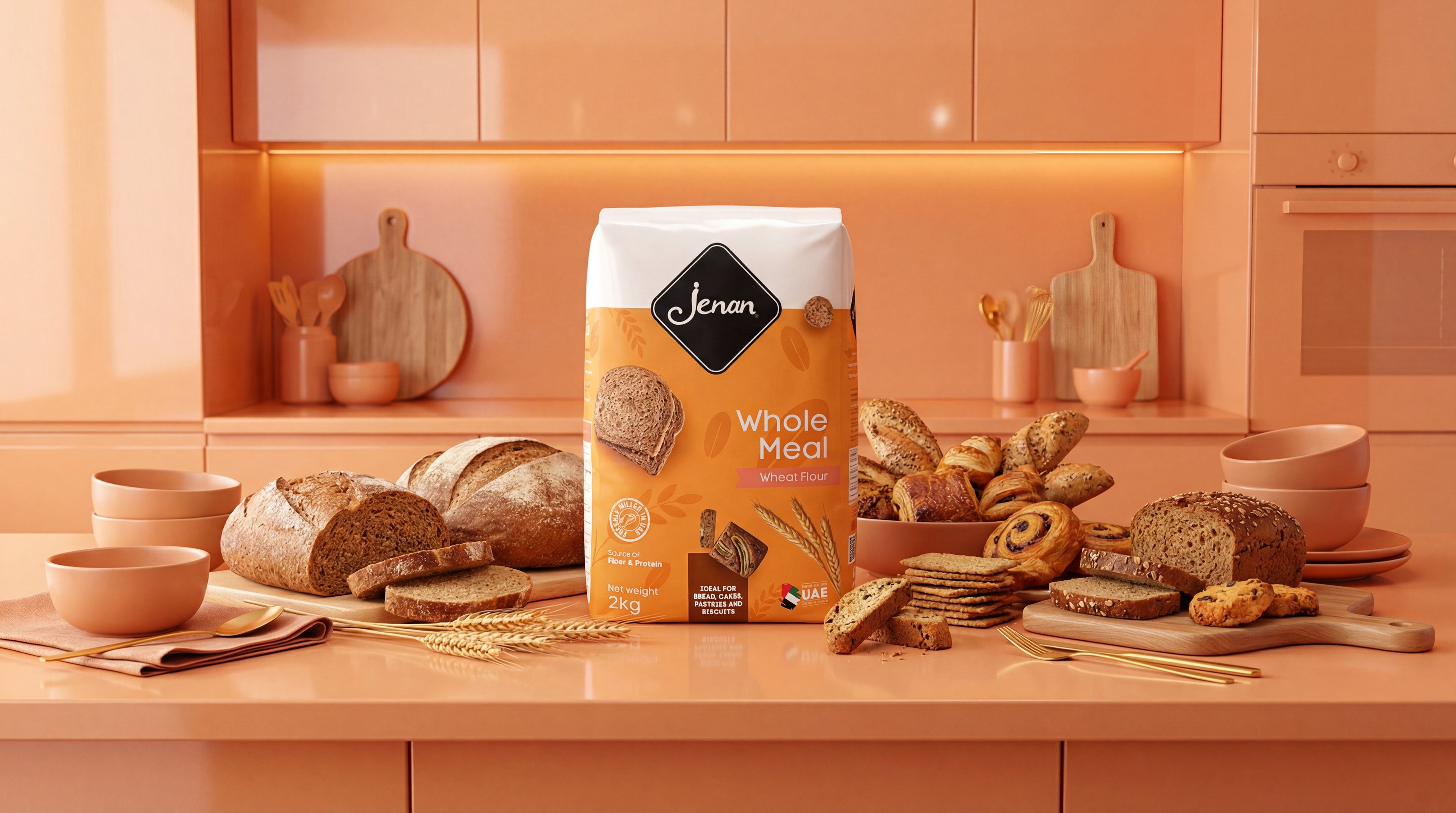
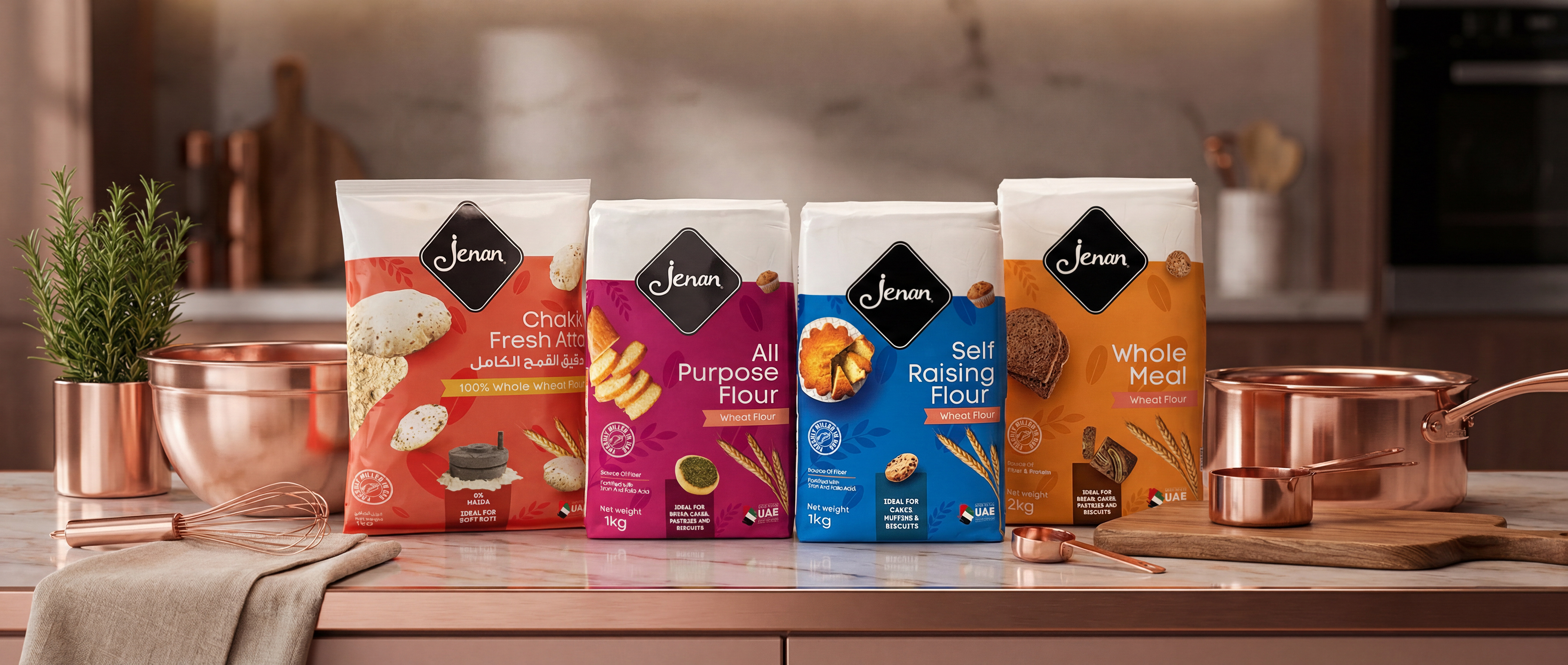
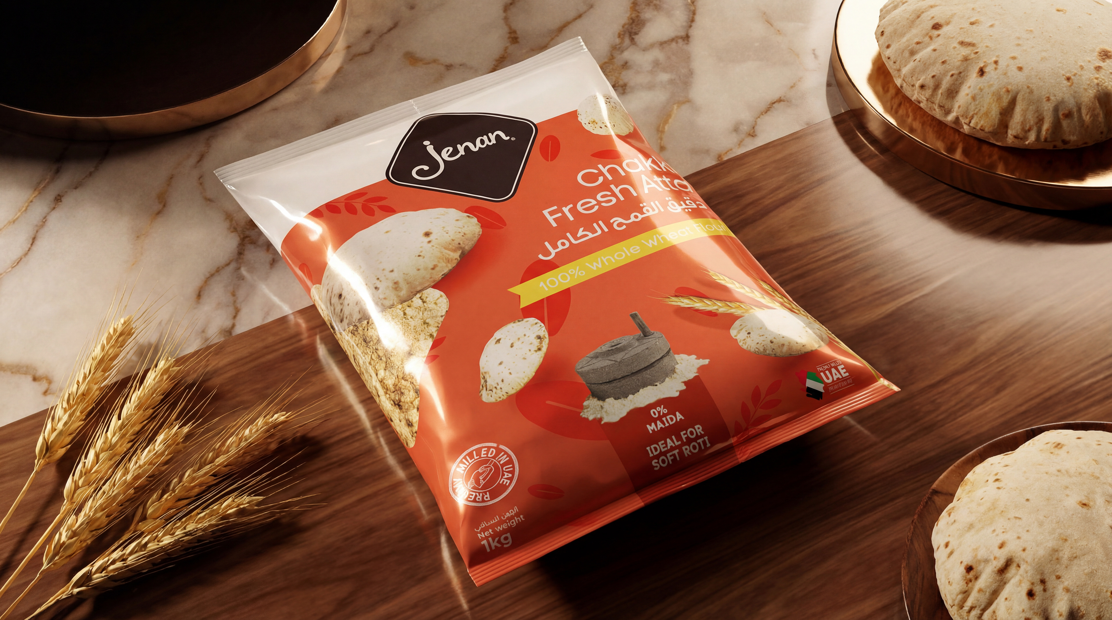
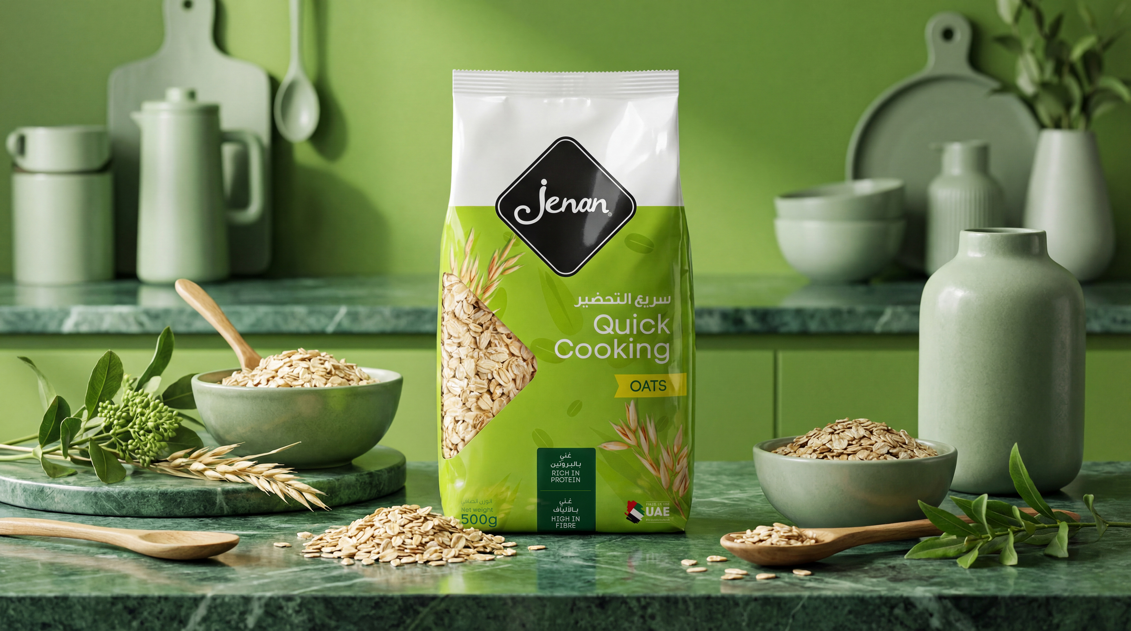
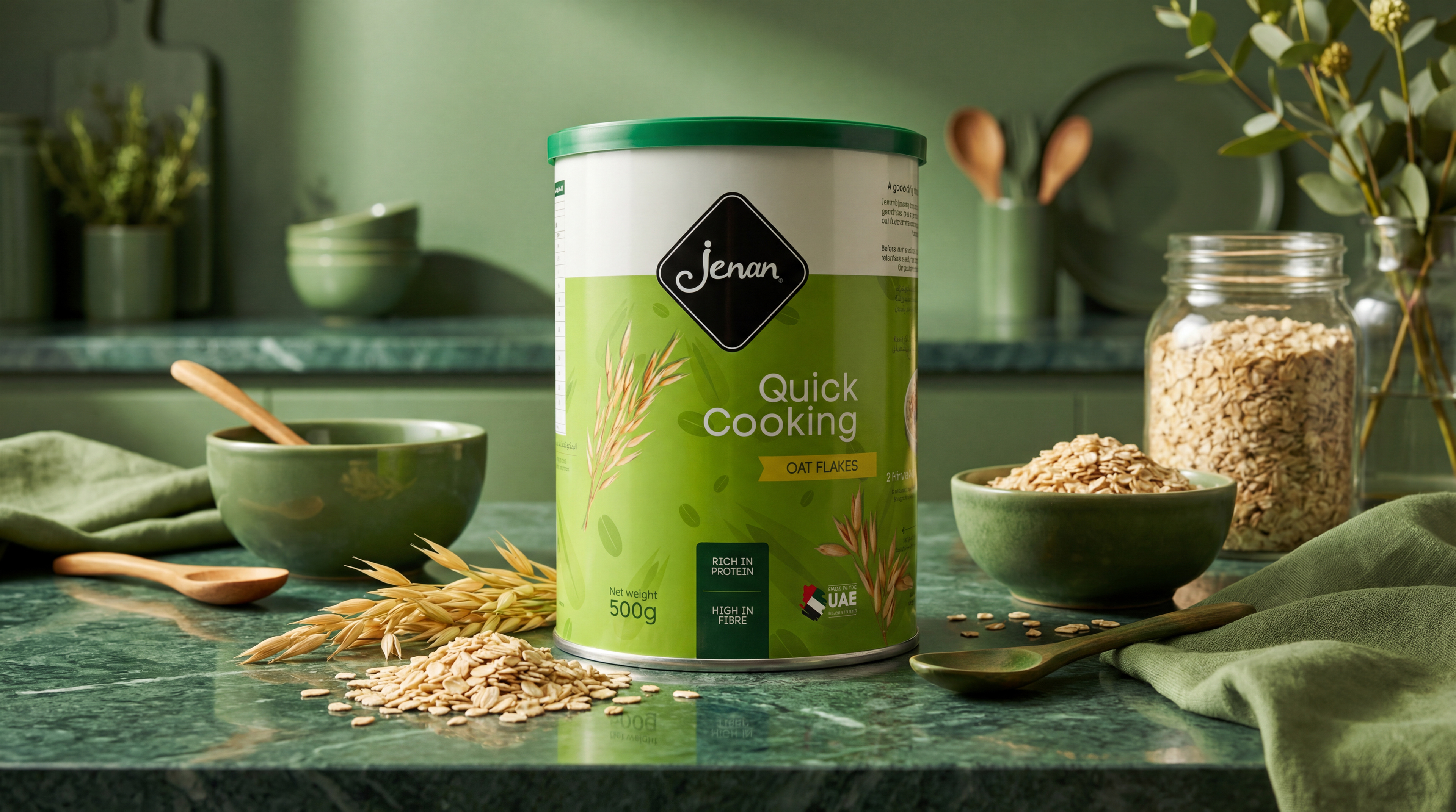
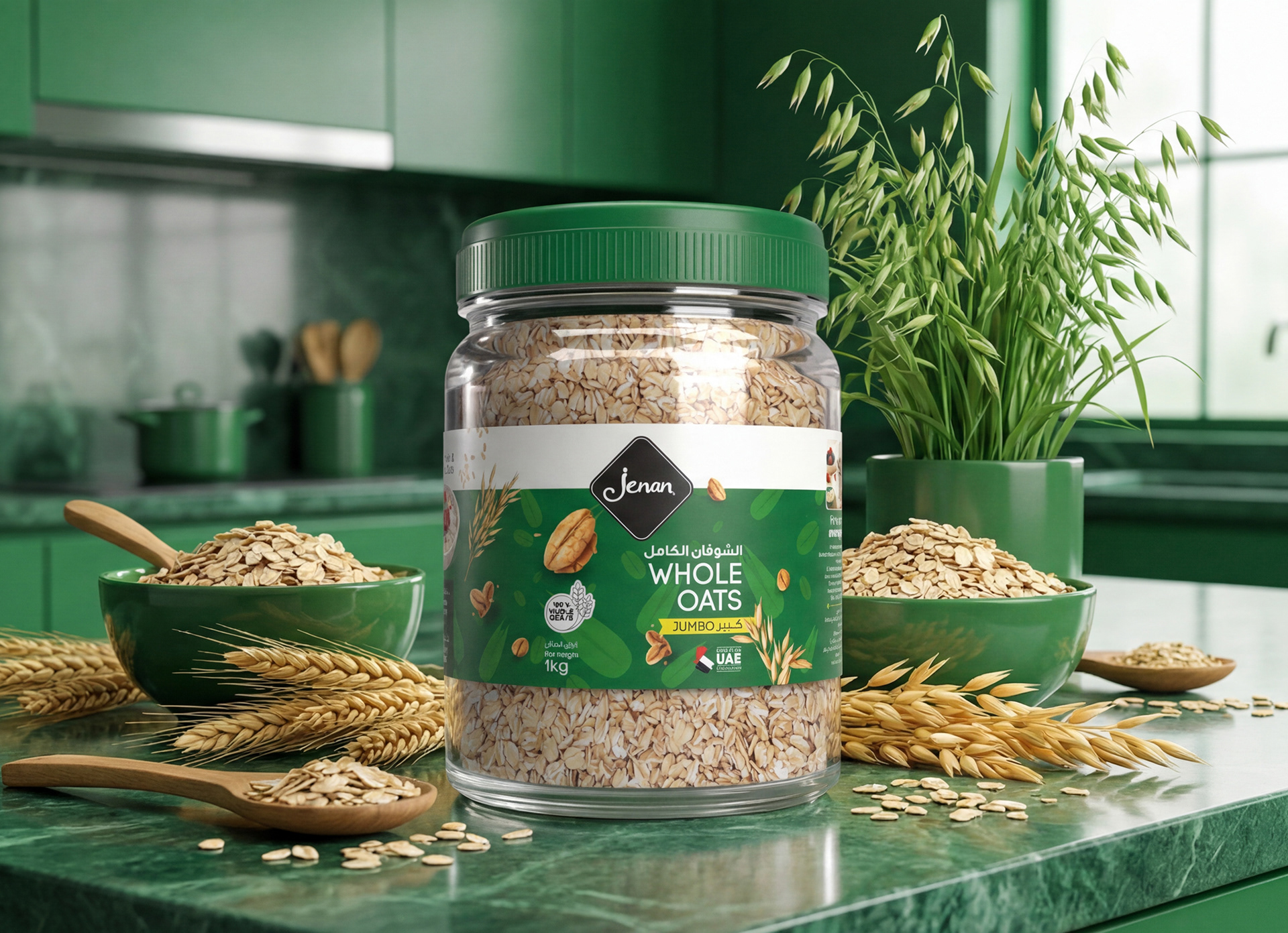
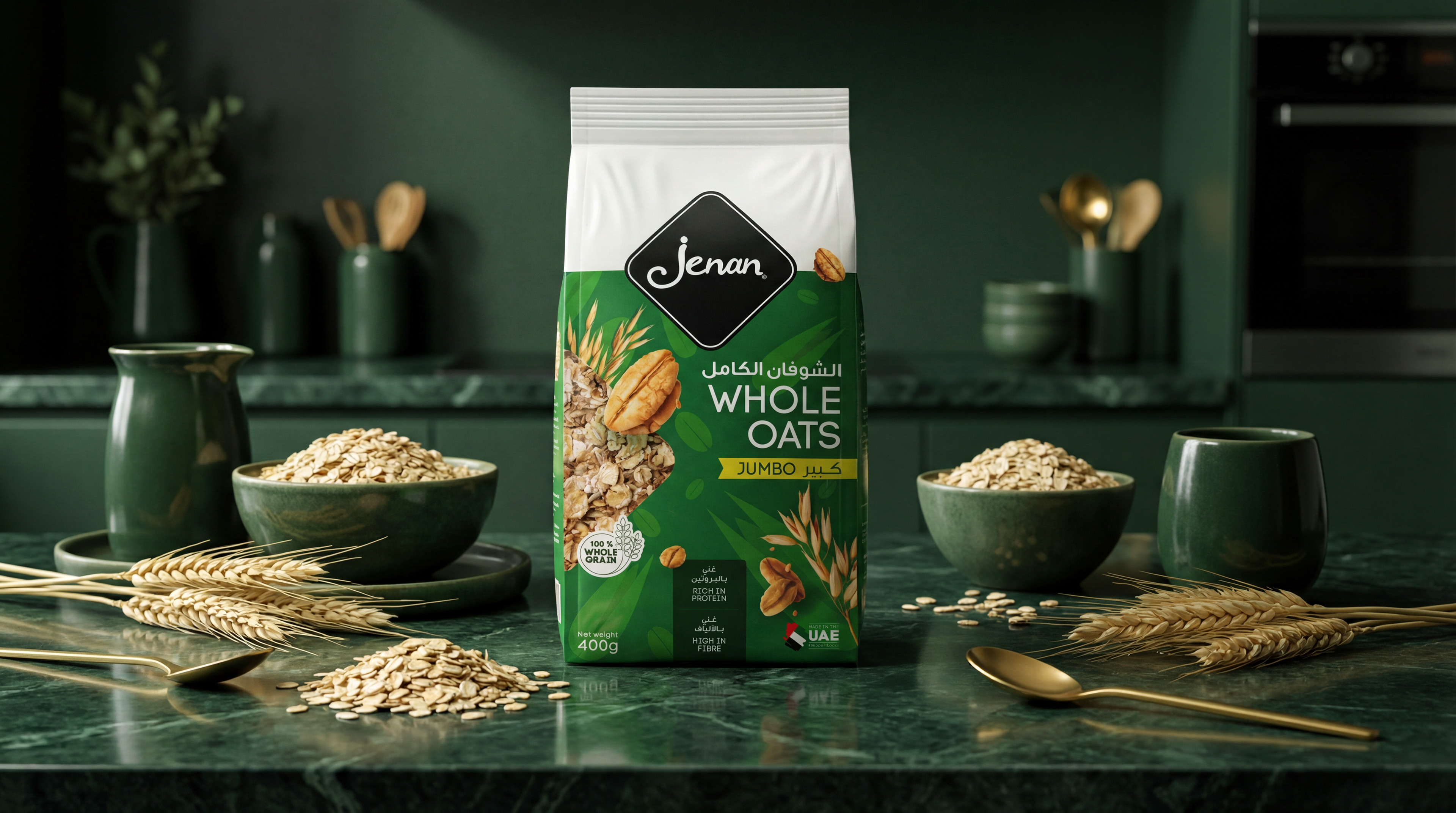
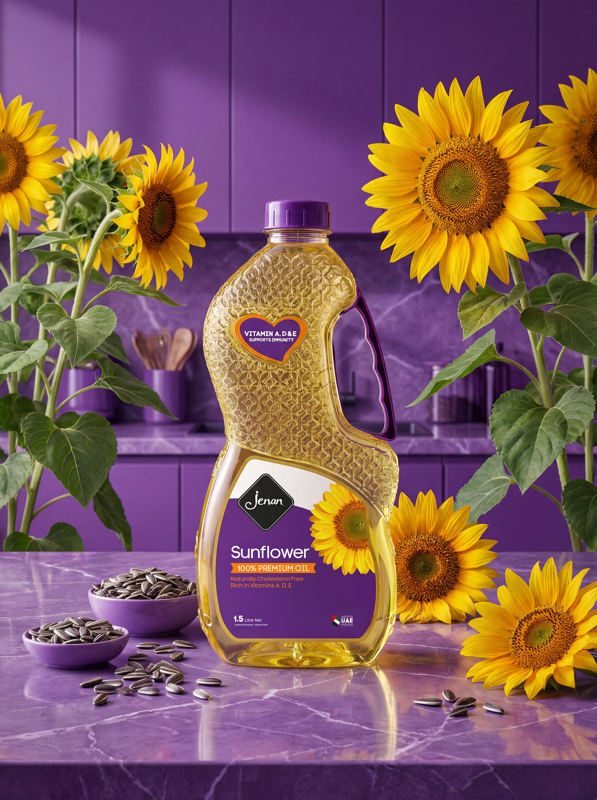
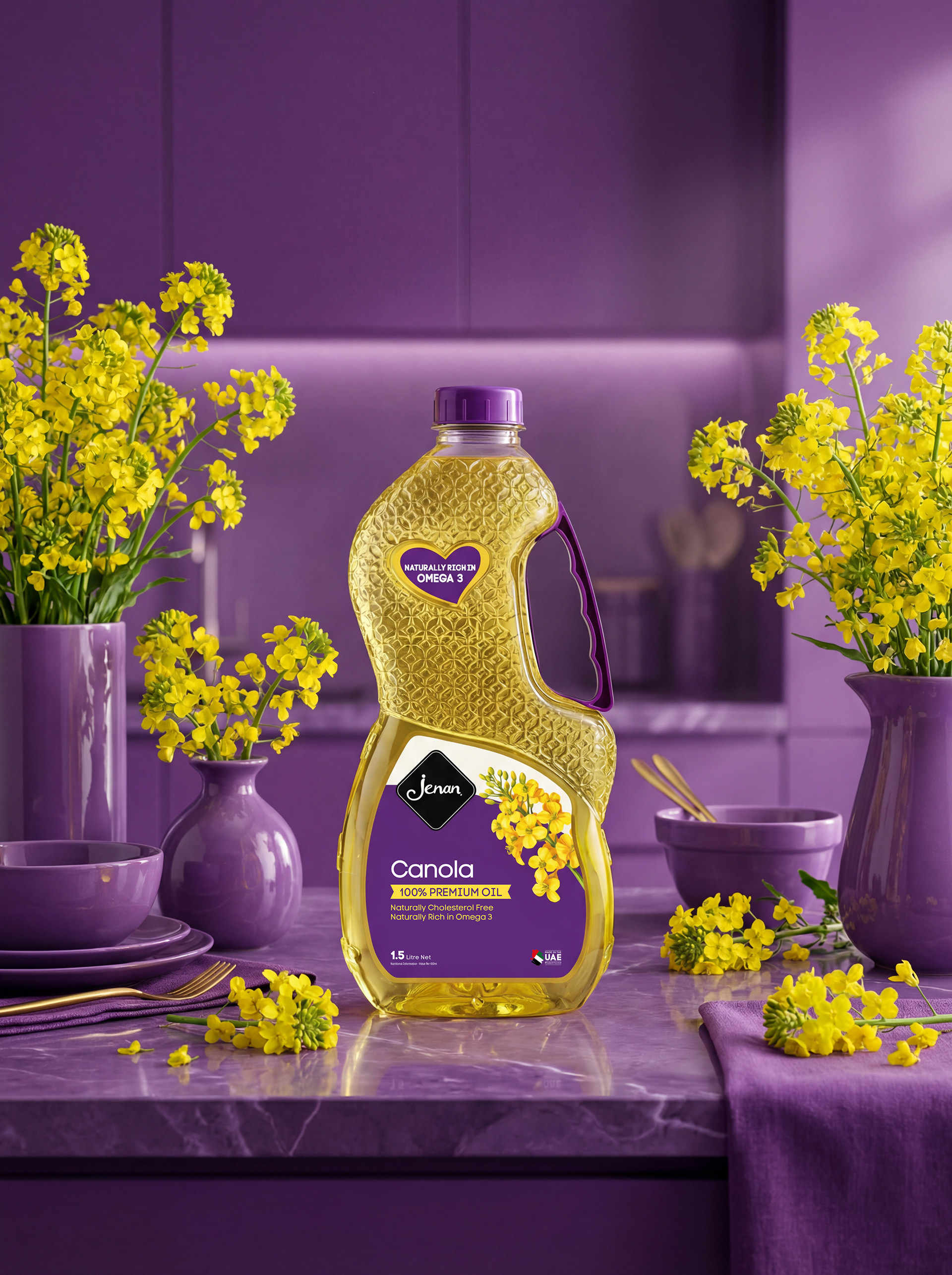
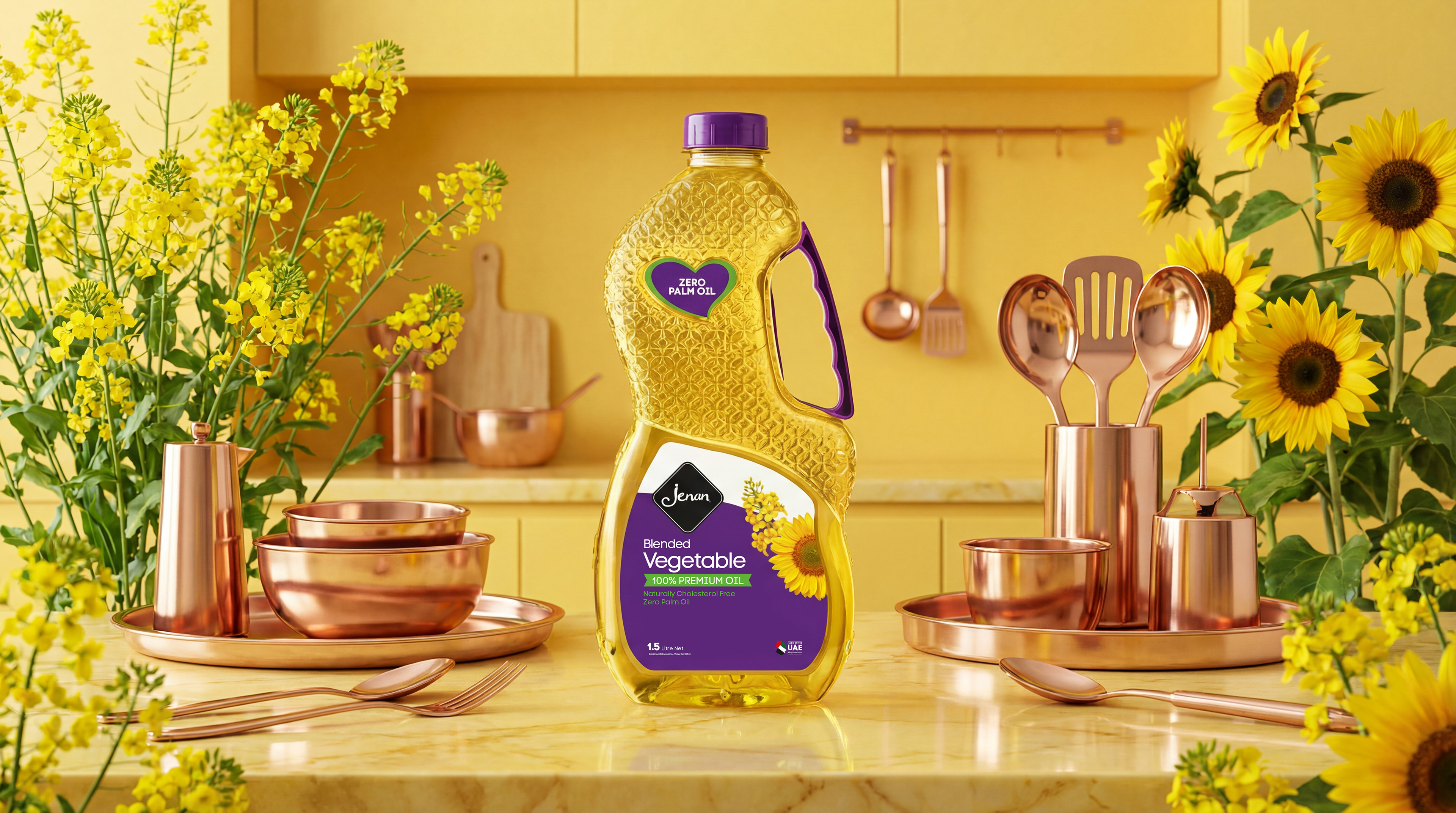
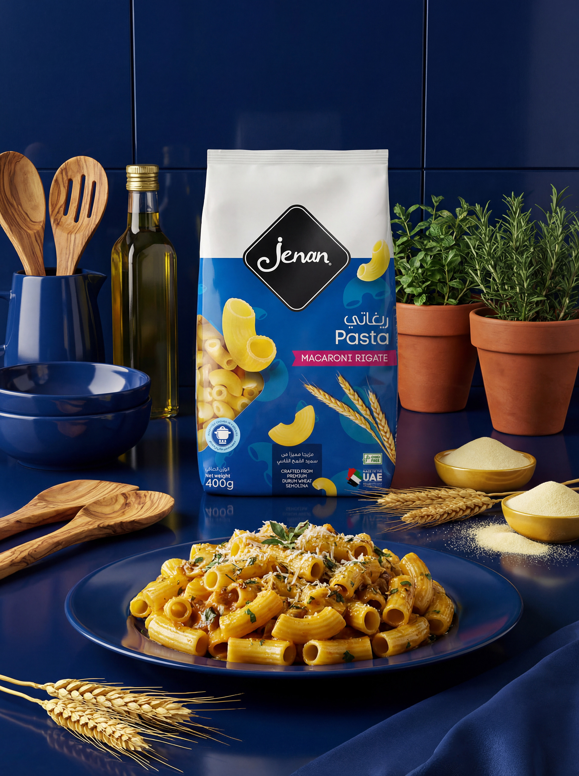
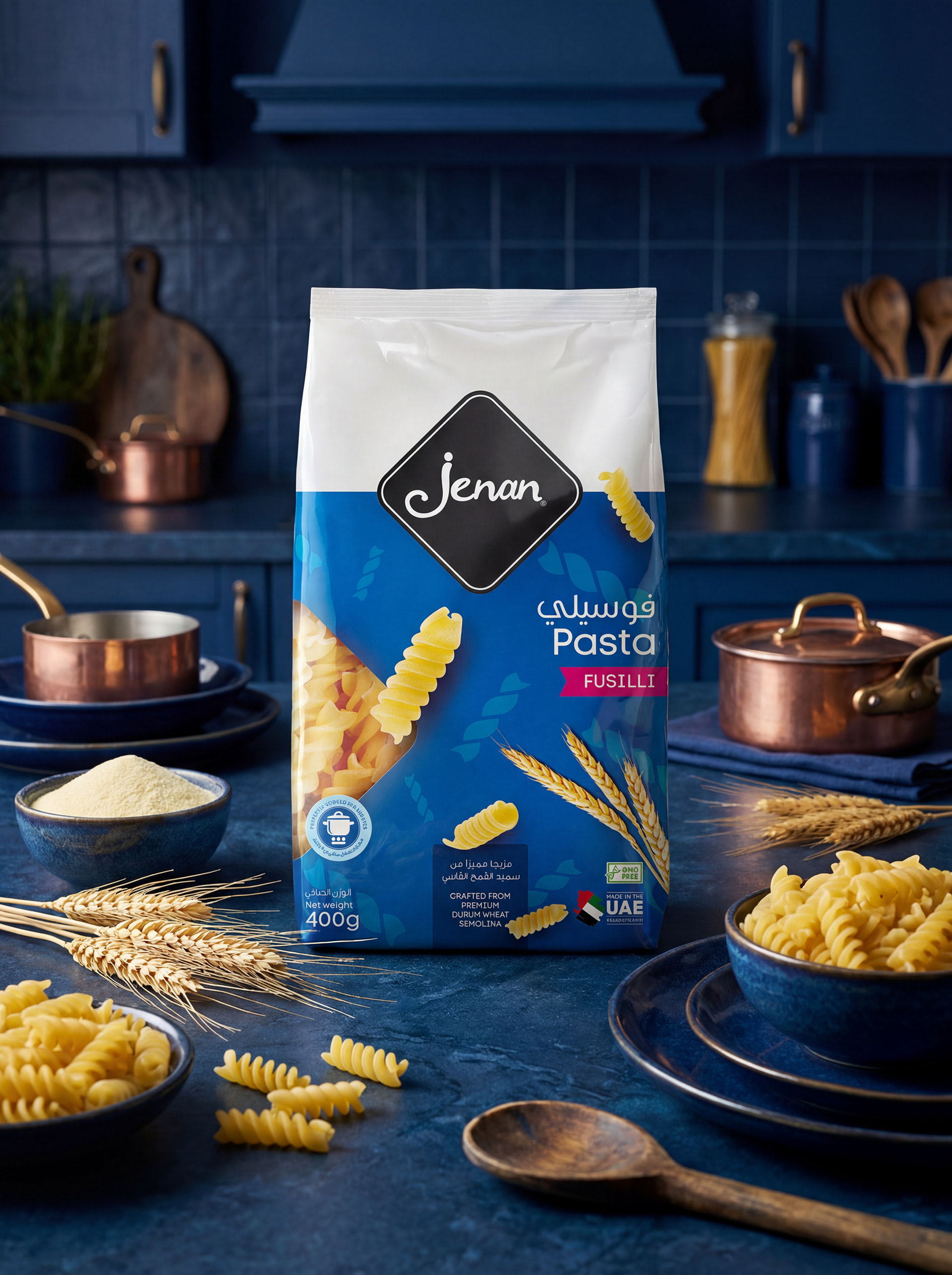
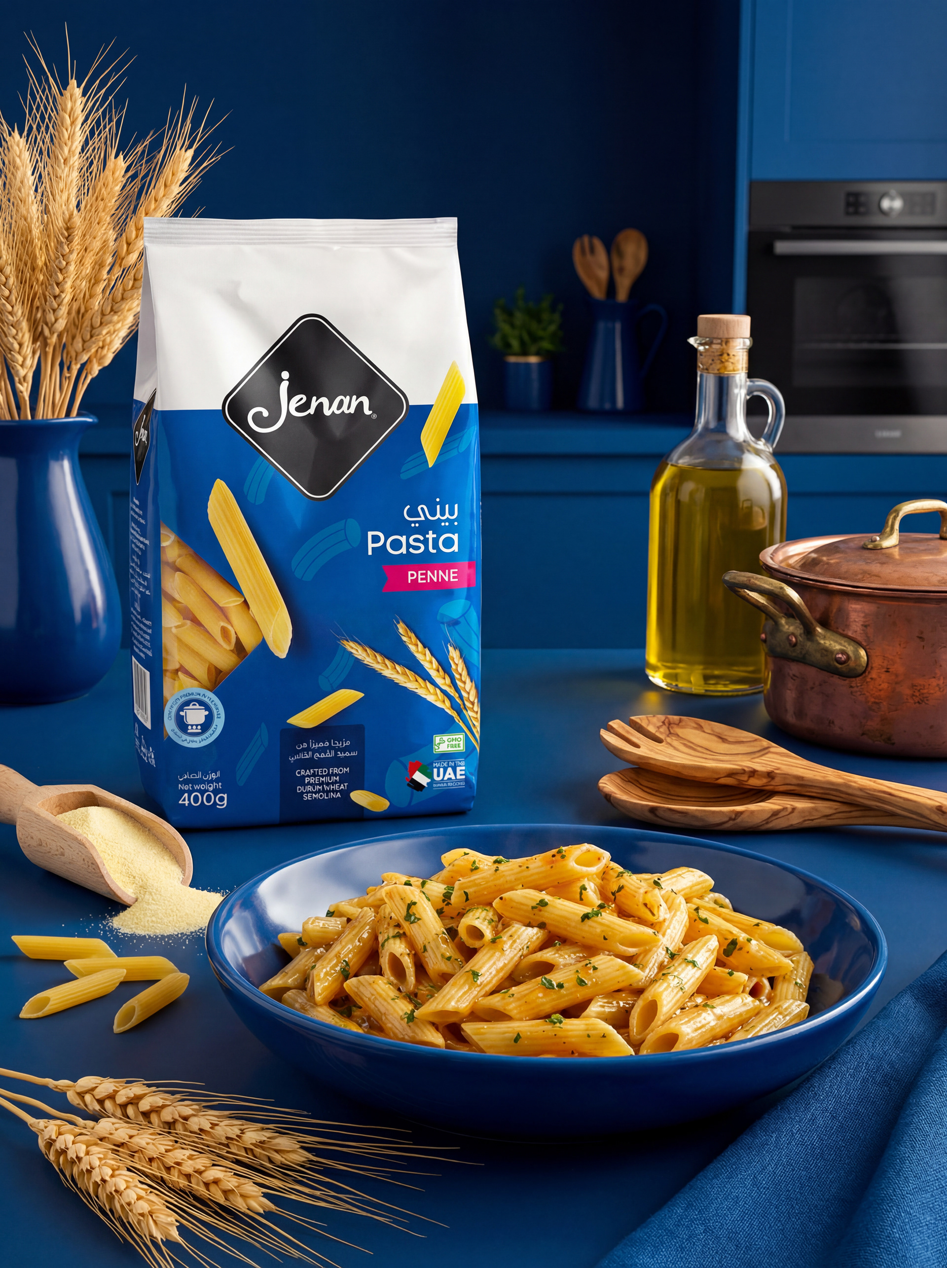
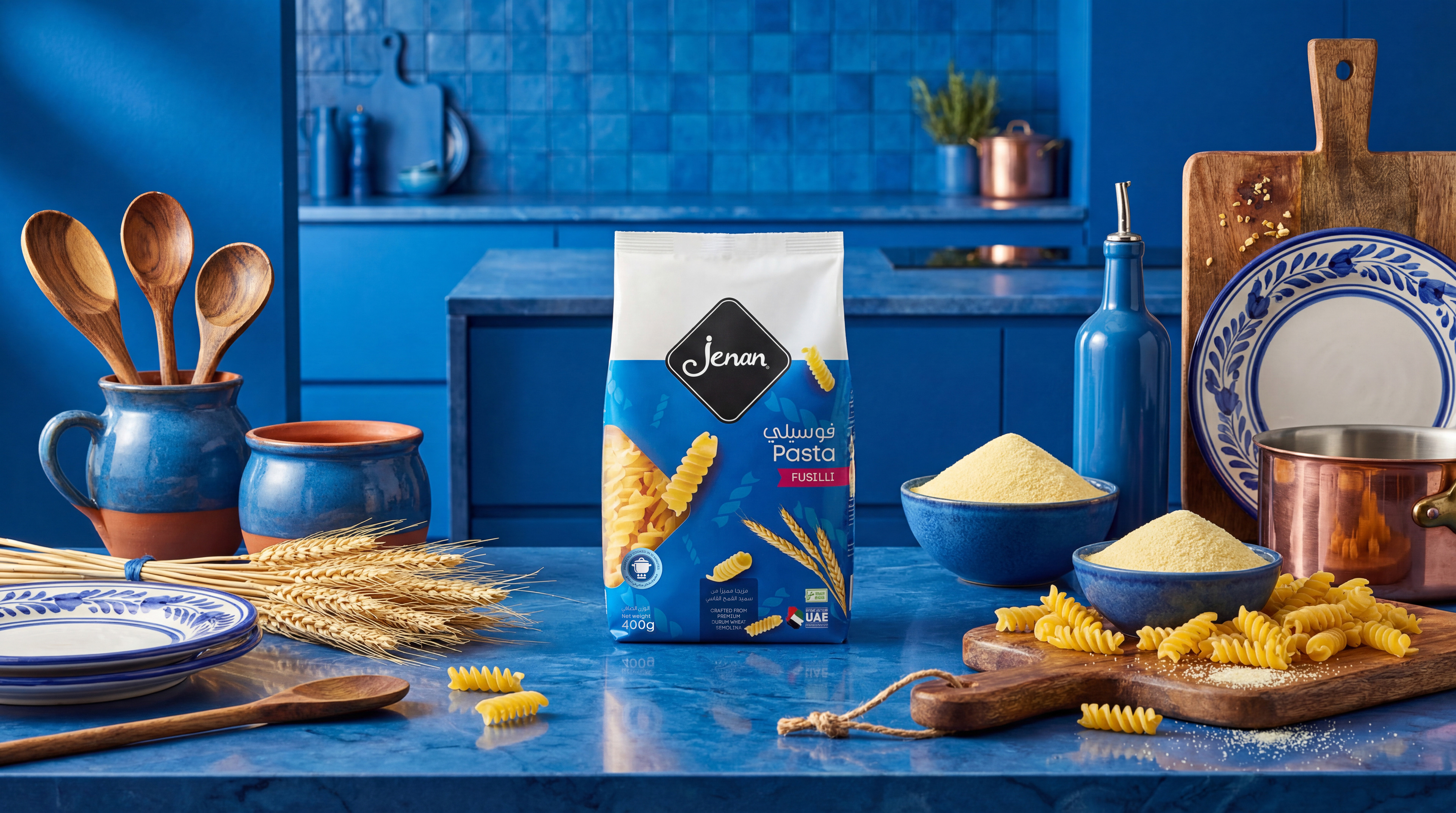
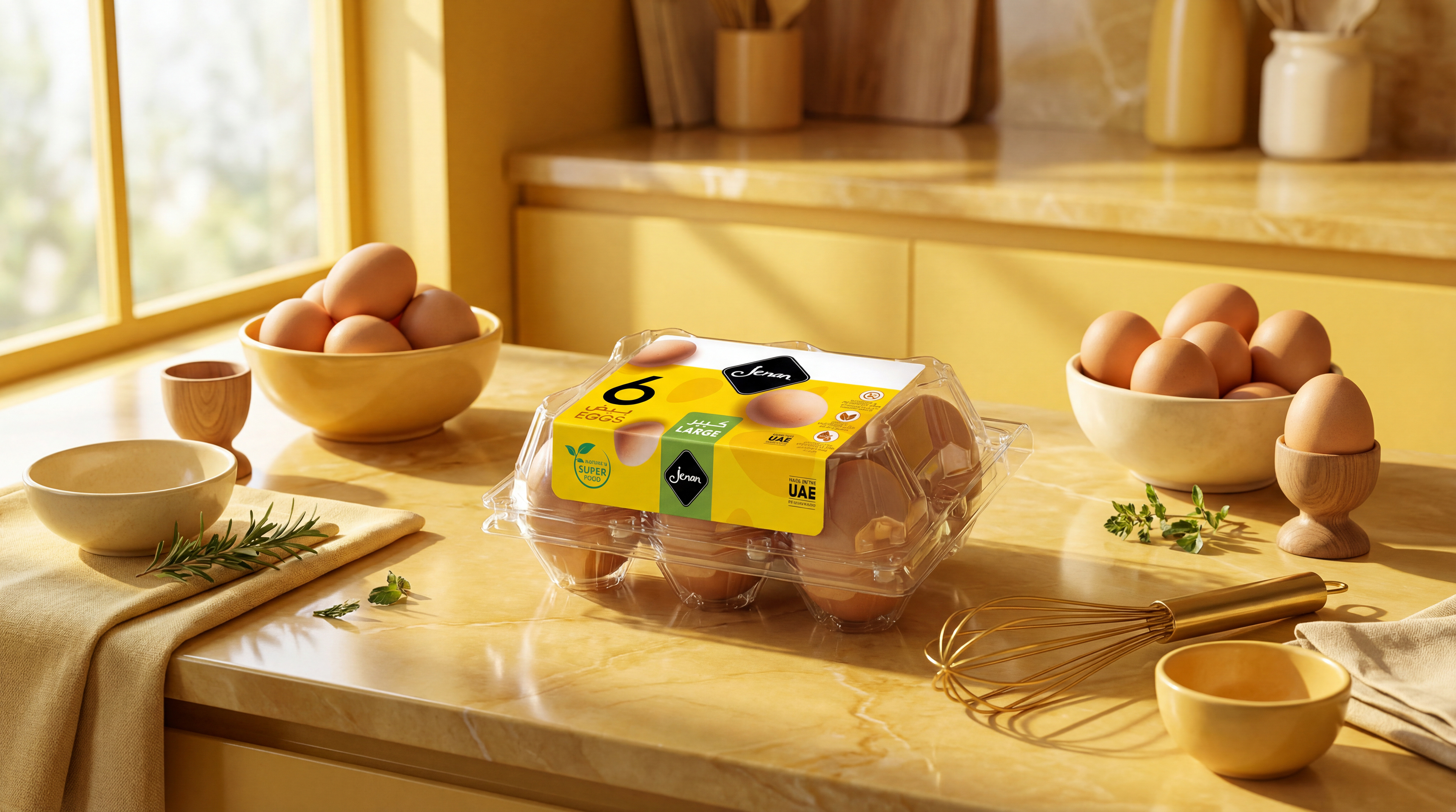
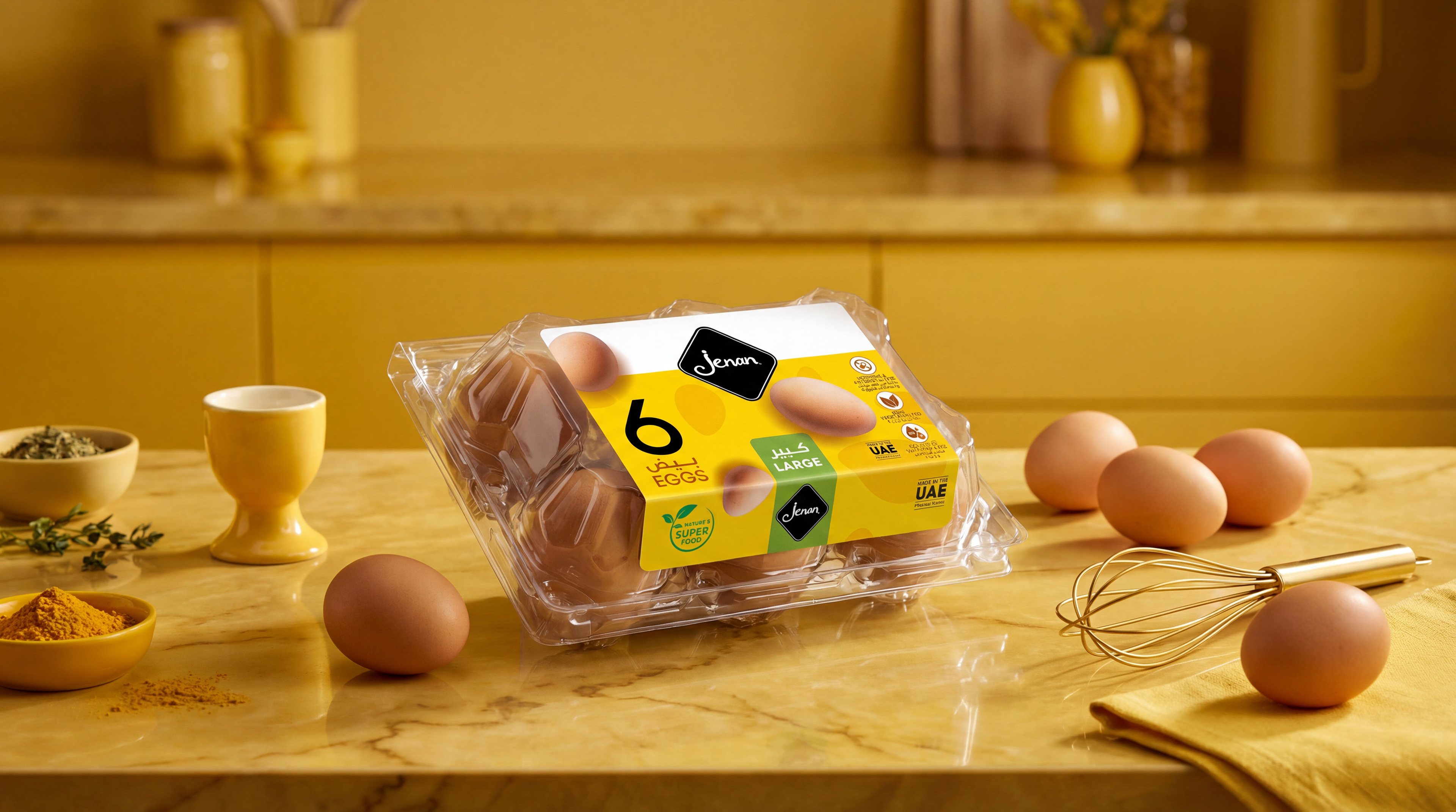
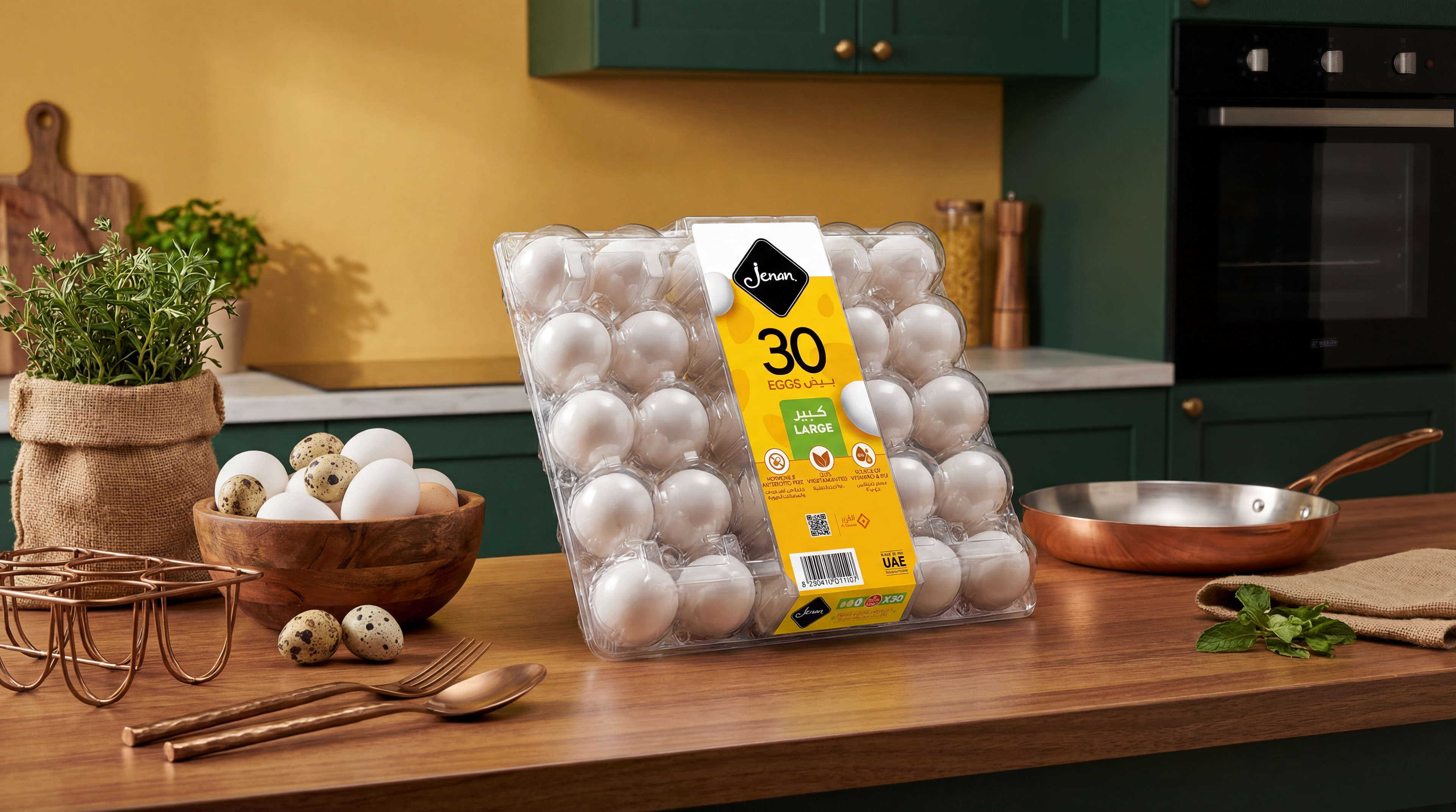
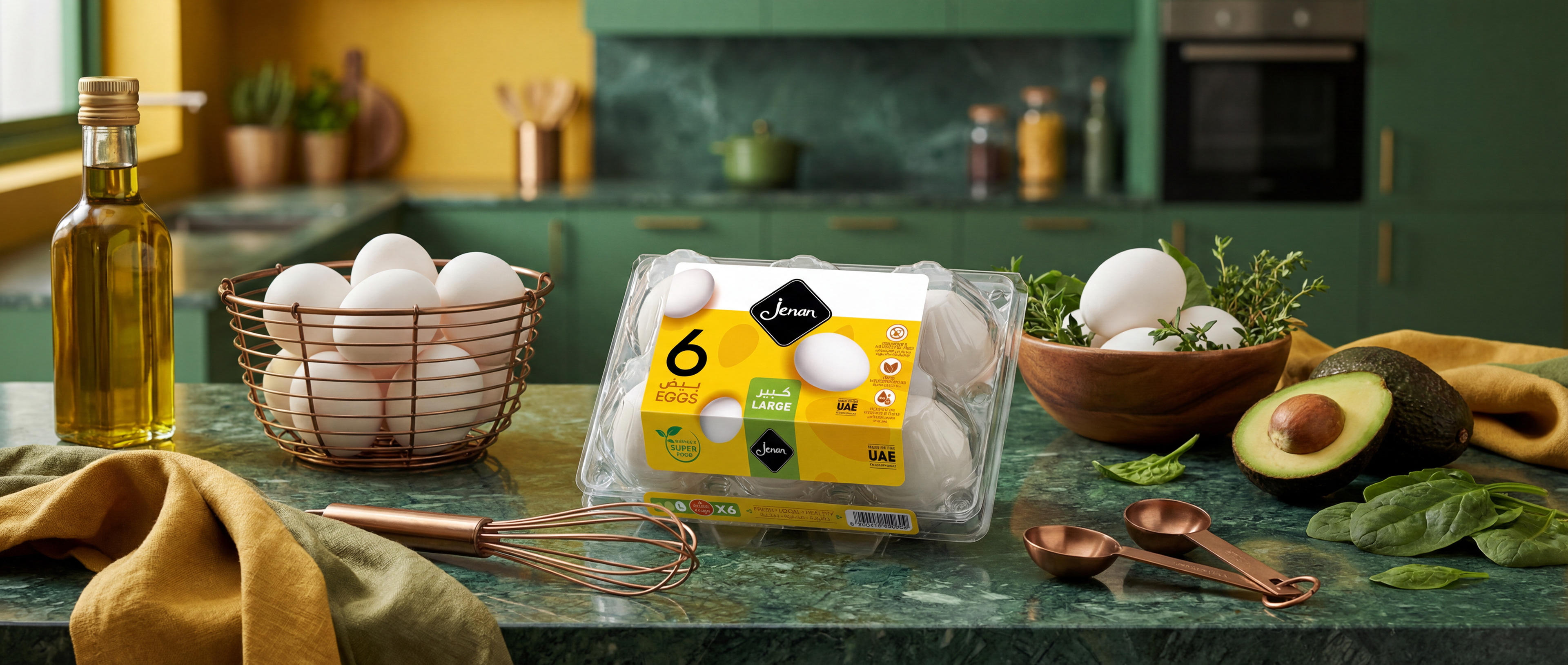
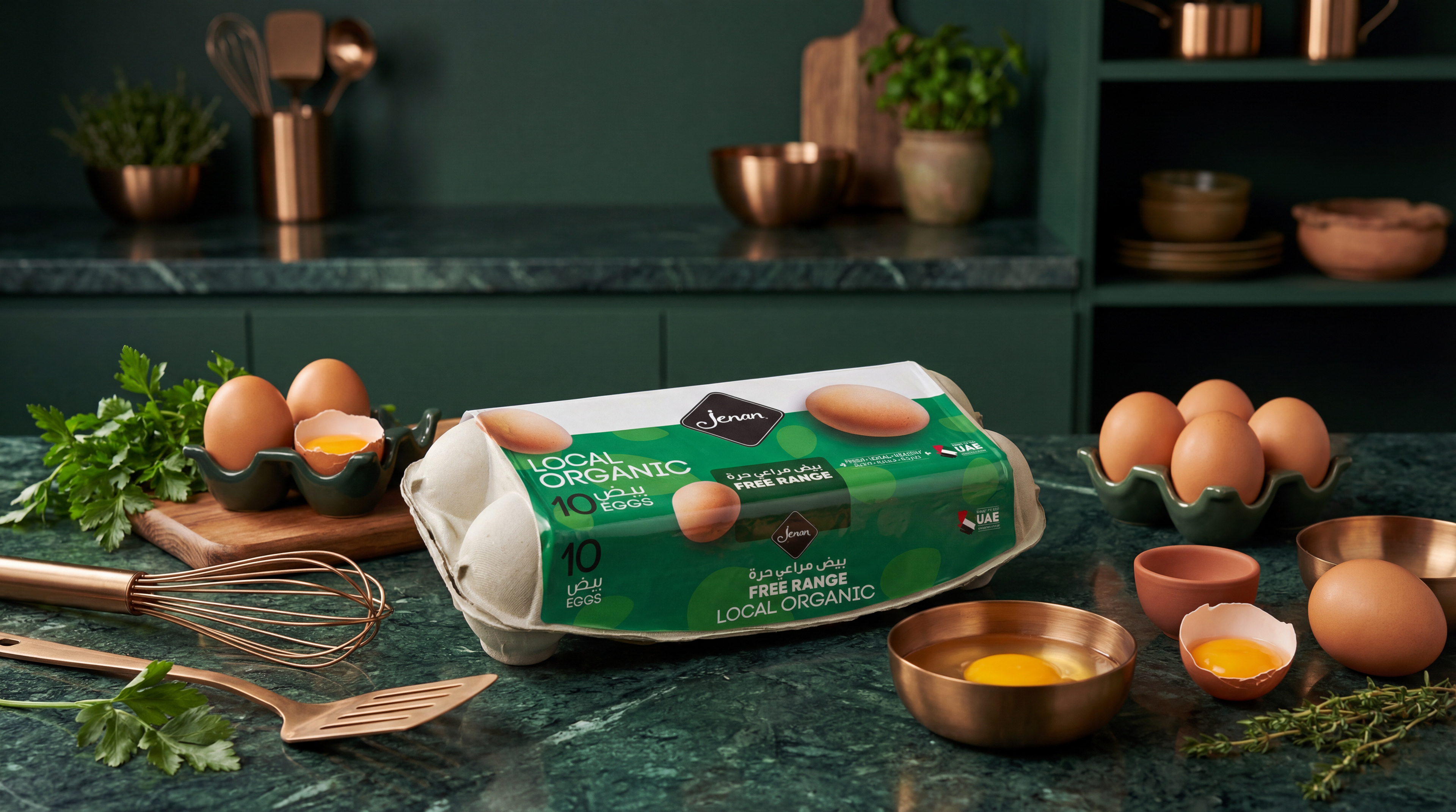
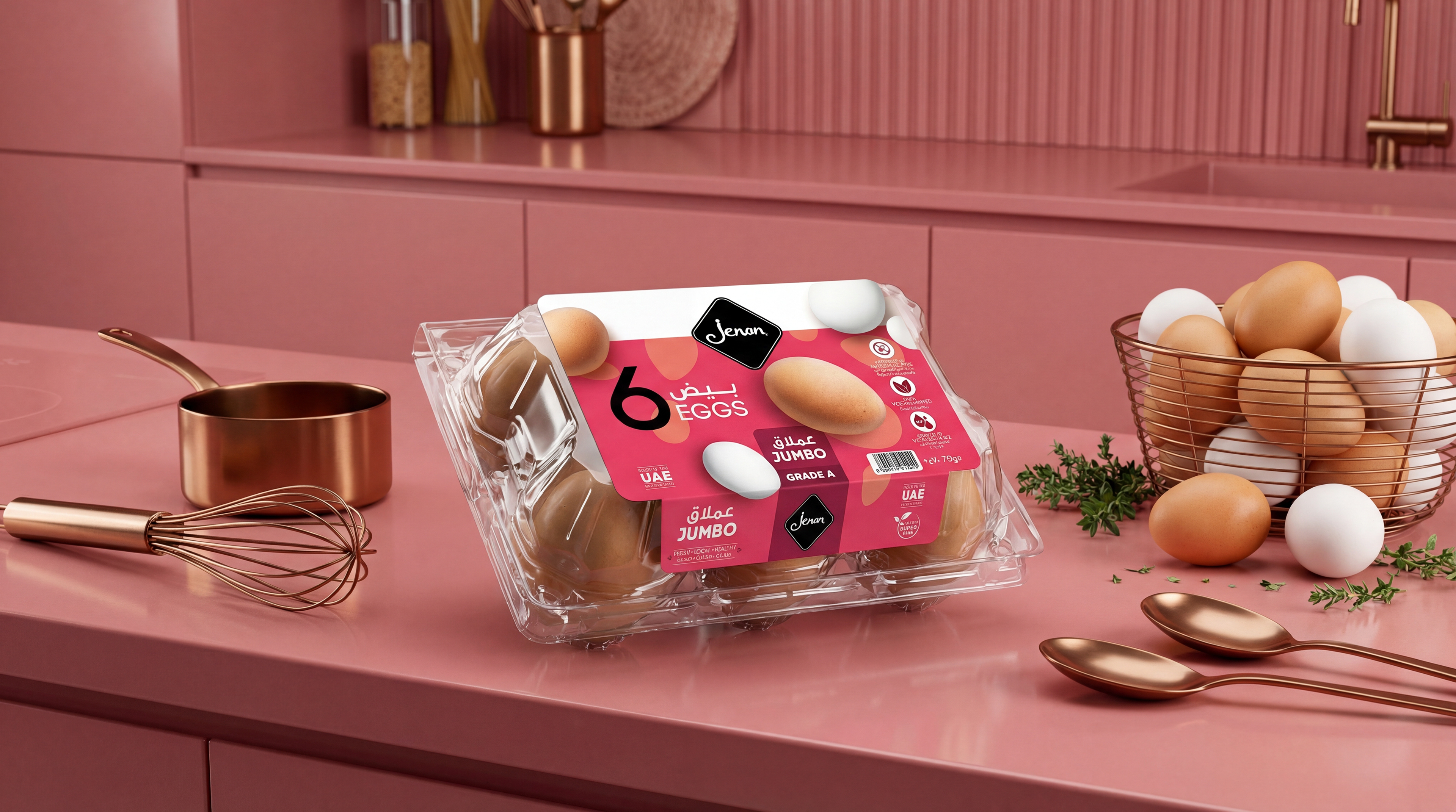
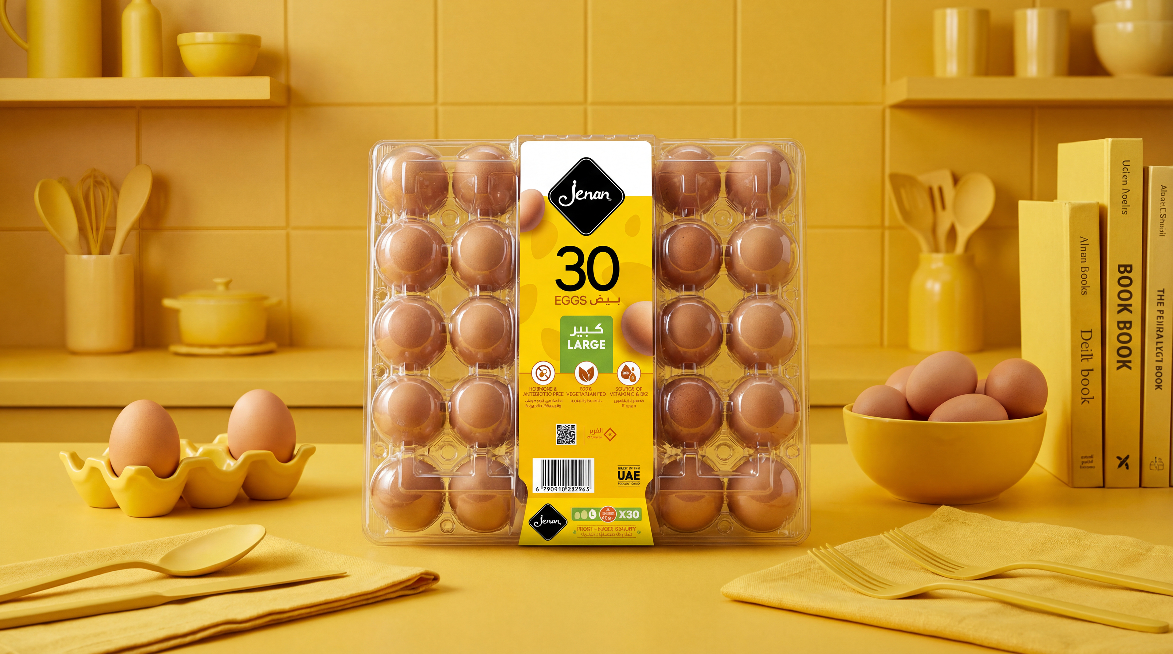
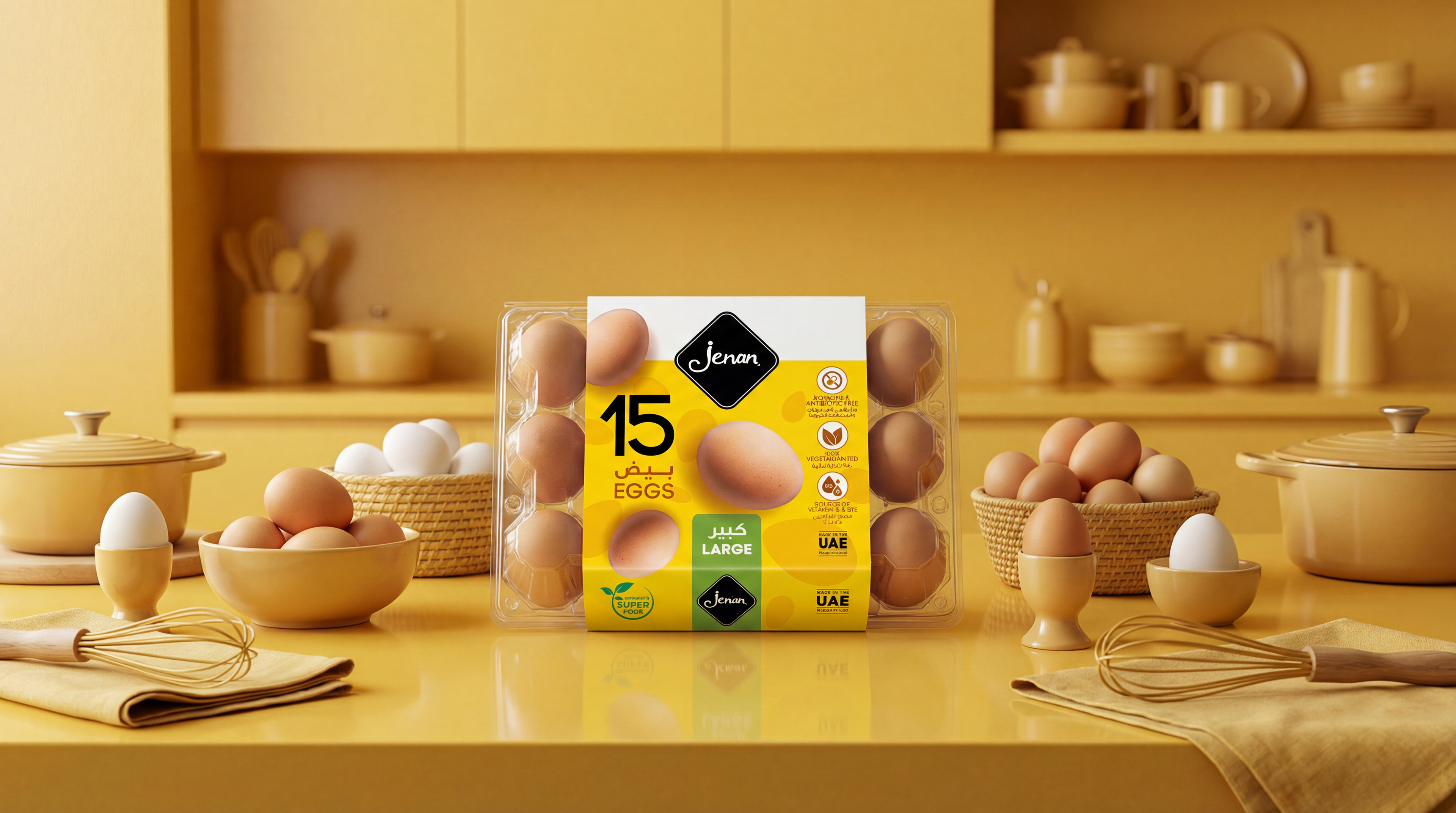
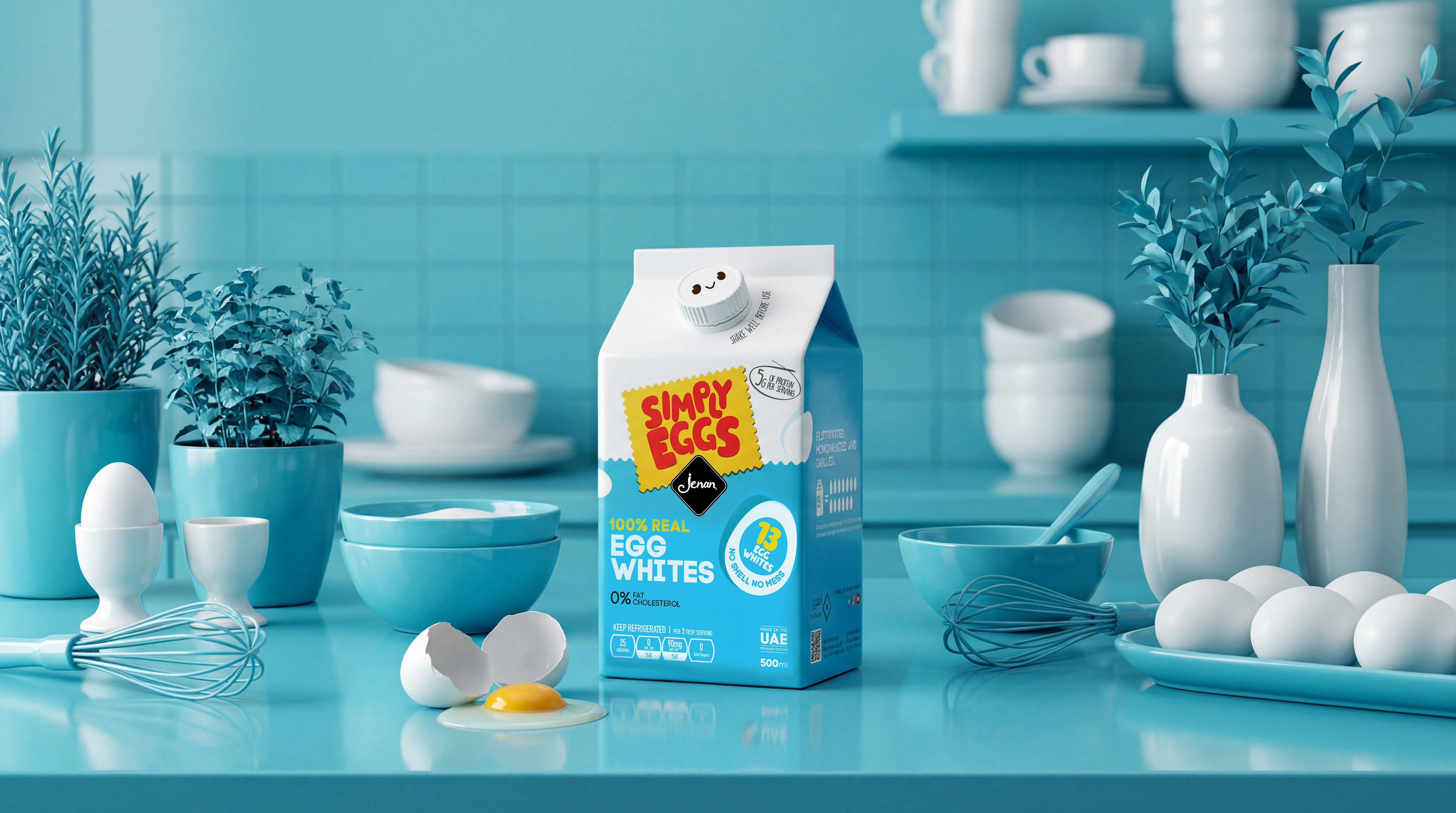
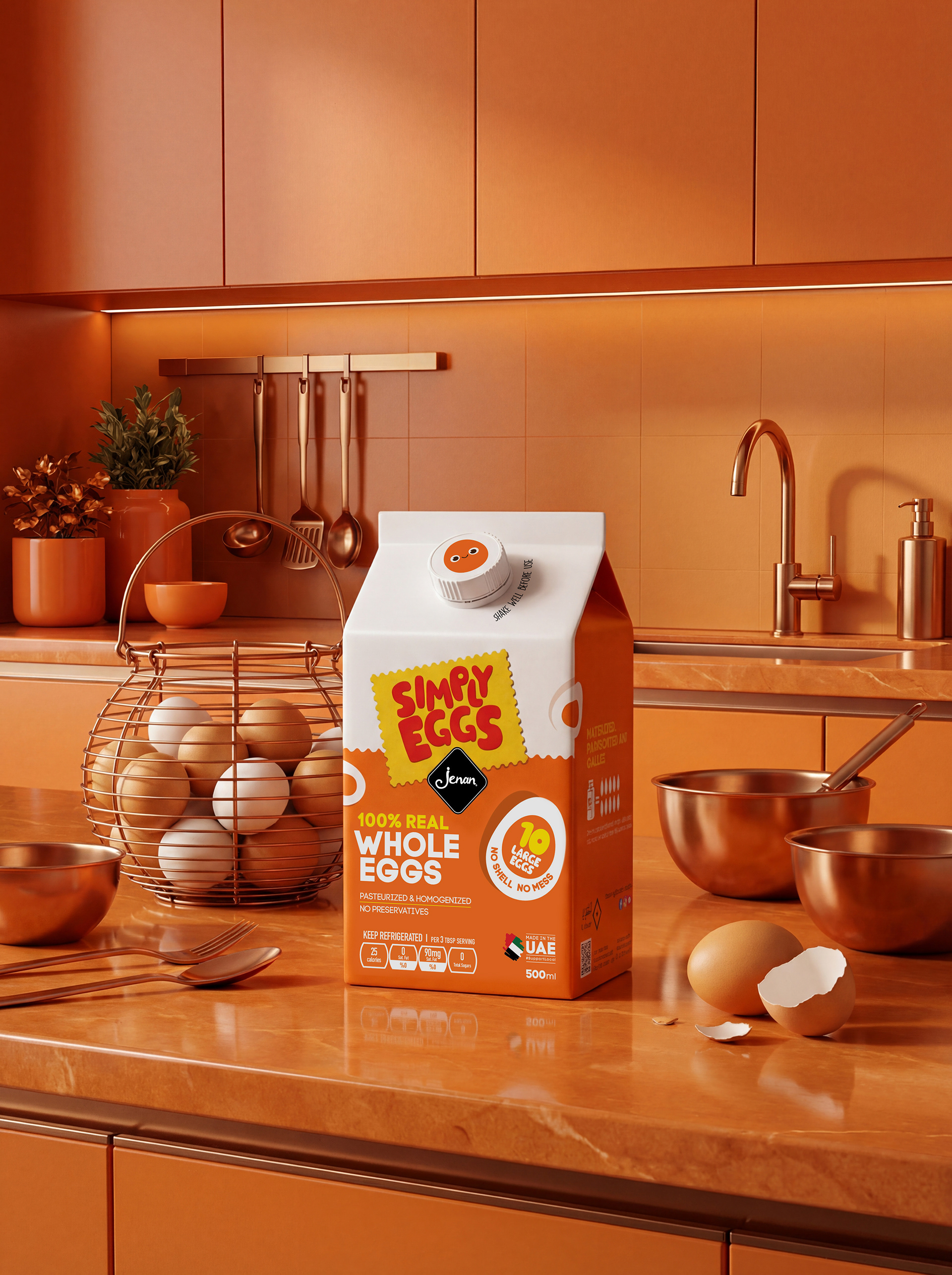
We created a "Packaging Skeleton" that brings consistency to the chaos.
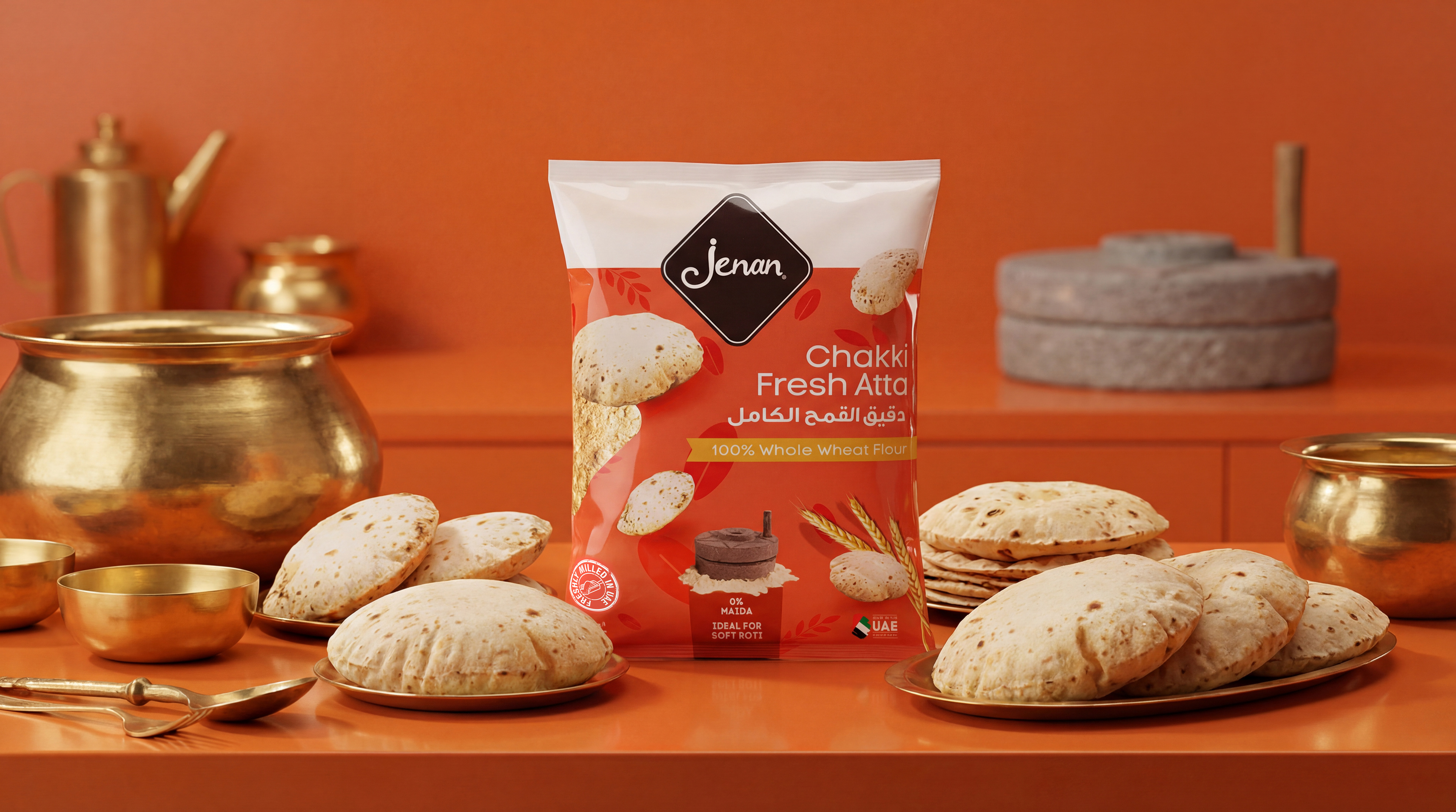
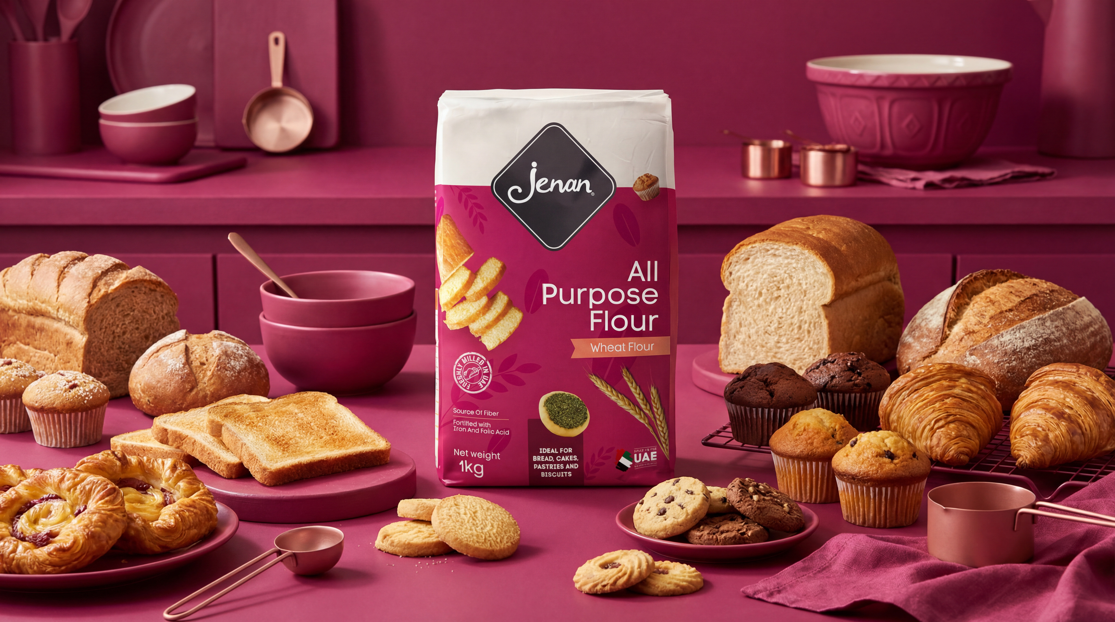
The Architecture: We introduced a consistent "Top Patch" across all formats, creating a uniform horizon line on the shelf that holds the brand mark.
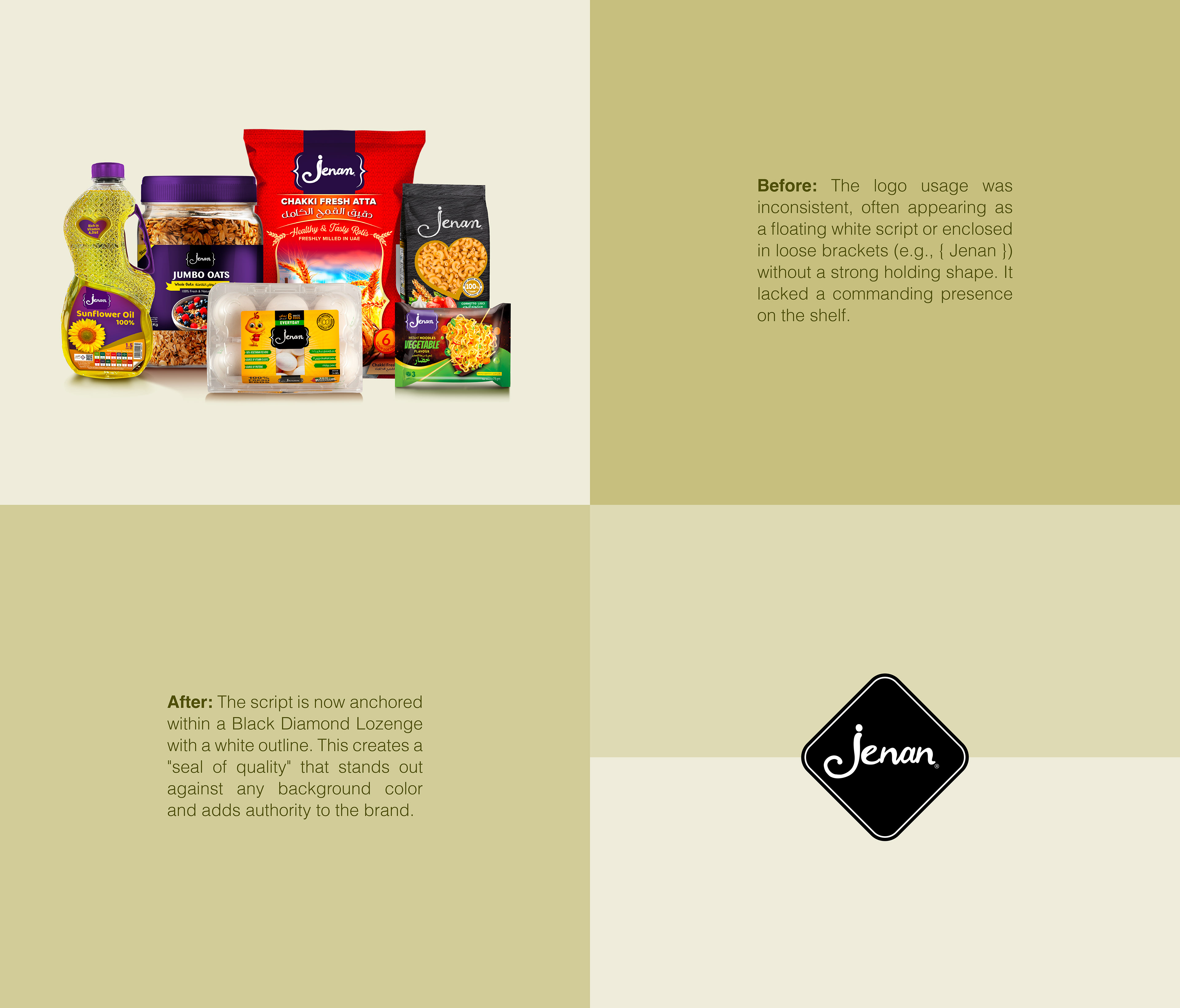
Logo Evolution: While keeping the typography, we enclosed the script in a black diamond shape, elevating its contrast and premium feel.
Category Coding: We utilized a flat color-coding system to differentiate categories (e.g., distinct colors for Self-Raising vs. All-Purpose Flour).
Minimalist Textures: To add depth without clutter, we designed minimal background illustrations that represent the SKU inside such as subtle macaroni patterns for the pasta range or wheat motifs for flour.
This systematic approach transformed disparate products into a synchronized family, balancing modern minimalism with the warmth of a trusted local brand